Fine particulate matter (PM2.5) consists of airborne particles 2.5 micrometers in diameter or smaller. They are tiny enough to travel deep into the lungs and pose serious health risks. Monitoring stations can measure these particles at specific locations; the conditions between those stations have to be estimated.
This project compared three spatial interpolation methods — Inverse Distance Weighted (IDW), Spline, and Kriging — to estimate PM2.5 concentrations across the contiguous United States. The resulting surfaces were then tested against monitoring sites withheld from the analysis to determine which method produced the most reliable predictions.
Monitoring coverage and input data
| Dataset | Provider | Role in the analysis |
|---|---|---|
| AirNow Current Monitor Data Public | U.S. Environmental Protection Agency | PM2.5 monitoring locations and concentration readings |
| USA States Generalized Boundaries | Esri, developed from U.S. Census Bureau sources | Contiguous U.S. study extent and interpolation mask |
The AirNow feature service is updated continuously. This analysis used a snapshot accessed on June 11, 2025. Because the original service included monitoring sites outside the study area and records without usable PM2.5 measurements, I retained only:
- sites in the lower 48 states and Washington, D.C.;
- sites listed as active;
- records with a reported PM2.5 value; and
- concentrations greater than or equal to zero.
These filters reduced the original 4,392 records to 746 monitoring sites with valid PM2.5 measurements.

The uneven distribution of the monitoring sites created the problem interpolation was intended to address. Interpolation can estimate values between measurements, but the distance to the nearest observation varies greatly across the country.
The state boundaries were used to define and mask the contiguous U.S. study area. All layers were projected to NAD83 / Conus Albers (EPSG:5070), providing a common projected coordinate system in meters for the national-scale analysis. Each interpolation surface was produced at a 1,000-meter cell size.
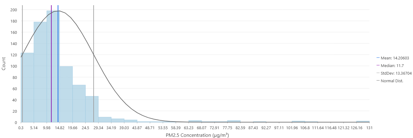
The PM2.5 observations were strongly right-skewed. Most sites reported relatively low concentrations, while a small number of readings extended to a maximum of 131 µg/m³.
Building and testing the surfaces
To test the interpolation methods against observations they had not already encountered, I divided the monitoring sites into two groups:
- Training set: 671 sites, or 90 percent, used to create the interpolation surfaces
- Test set: 75 sites, or 10 percent, withheld until model evaluation
All three methods therefore began with the same training data and study extent. Each method used 12 nearby monitoring sites to estimate values at unsampled locations, but they differed in how those observations influenced the resulting surface.
Comparing the interpolation surfaces
The interpolation tools produced continuous floating-point rasters. ArcGIS Pro initially displayed each surface using nine geometric-interval classes. These method-specific classes preserve variation within each output, but their numerical ranges differ. Matching colors should therefore be interpreted within each map rather than compared directly across the three methods.
IDW and the influence of nearby sites
Inverse Distance Weighted interpolation estimates an unknown value from nearby measurements, assigning greater influence to closer sites. I used a power value of 2 and a variable search radius containing the 12 nearest monitoring sites.
Because IDW calculates a weighted average, its predictions remain within the range of the input observations. The resulting surface preserves relatively localized pockets of higher and lower concentrations around monitoring sites.

Spline and the cost of smoothness
Spline fits a smooth surface that passes through the measured values while minimizing overall curvature. I used the Regularized option with a weight of 0.1 and 12 nearby monitoring sites.
The method produced the smoothest-looking surface, but it also generated the least plausible values. Predictions ranged from approximately −1,026.5 to 270.9 µg/m³, far beyond the observed range of 0.3 to 131 µg/m³. Negative PM2.5 concentrations are not physically meaningful; they are artifacts created as the fitted surface bends between monitoring sites.
Because the method-specific legend follows ArcGIS Pro’s geometric intervals, negative estimates are distributed across several display classes rather than isolated in a single category.

Kriging and spatial structure
Kriging estimates unknown values by modeling the spatial relationship among measured observations. Unlike IDW, which relies primarily on distance, Kriging considers how PM2.5 values are correlated across space.
I used Ordinary Kriging with a spherical semivariogram model and a variable search radius containing 12 monitoring sites. The resulting surface remained within the approximate range of the observed measurements while representing both broad regional patterns and localized variation.

Putting the surfaces on a common scale
The method-specific maps reveal detail within each interpolation surface, but their different class breaks prevent direct comparison. To standardize the outputs, I symbolized all three surfaces using the same PM2.5 concentration ranges associated with the EPA’s Air Quality Index categories.
The EPA breakpoints apply to 24-hour PM2.5 concentrations. Here, they provide a shared interpretive scale for comparing the interpolated concentration surfaces; the maps are not formal AQI calculations for the June 11 snapshot.
| AQI-associated category | PM2.5 concentration range |
|---|---|
| Good | 0.0–9.0 µg/m³ |
| Moderate | 9.1–35.4 µg/m³ |
| Unhealthy for Sensitive Groups | 35.5–55.4 µg/m³ |
| Unhealthy | 55.5–125.4 µg/m³ |
| Very Unhealthy | 125.5–225.4 µg/m³ |
| Hazardous | 225.5+ µg/m³ |
Values below zero do not belong to any of these concentration ranges. They were therefore assigned to a separate gray “Invalid model estimate” class in the standardized Spline map.


The common classification makes the methods easier to compare, but it also exposes an important difference. The observed maximum of 131 µg/m³ falls within the “Very Unhealthy” range under the current breakpoints. Only Spline reaches the “Hazardous” range, and it does so because the model predicts concentrations more than twice the highest observed value. Those areas should be interpreted as evidence of model instability, not measured hazardous air quality.
Testing predictions at held-out sites
I extracted a predicted value from each surface at the 75 test sites and compared those predictions with the observed PM2.5 measurements. Three statistics summarize the results:
- Mean Absolute Error (MAE): the average size of the prediction errors
- Root Mean Square Error (RMSE): an error measure that gives greater weight to large misses
- R²: how closely the predicted values tracked the observed values
| Interpolation method | MAE (µg/m³) | RMSE (µg/m³) | R² |
|---|---|---|---|
| IDW | 3.74 | 7.50 | 0.78 |
| Spline | 14.01 | 46.89 | −7.63 |
| Kriging | 3.50 | 6.20 | 0.85 |
For this test set, Kriging produced the lowest average error, the fewest large errors, and the strongest relationship between predicted and observed concentrations. IDW performed reasonably well but was slightly less accurate.
Spline performed substantially worse. Its negative R² indicates that its predictions at the test sites were less useful than simply assigning every site the mean observed concentration. The extreme values visible in the Spline surface were therefore not merely unusual-looking map patterns; they were accompanied by poor predictive performance.
Where the monitoring network runs out
Validation can show how a method performs at withheld monitoring sites, but it cannot fully test predictions where no monitoring network exists. The 75 test sites followed the same uneven geographic distribution as the original data, with greater representation in areas where monitoring was already relatively dense.
In the filtered June 11 snapshot, Arkansas, Georgia, Massachusetts, Utah, Virginia, Washington, and Wyoming contained no active AirNow site with a valid PM2.5 value. Estimates within those states depended entirely on observations beyond their borders.

This does not mean that interpolation is unusable in those areas, but it does make the predictions less directly supported by nearby measurements. The same concern applies to sparsely monitored rural areas within states that did contain one or more sites.
The analysis also represents conditions from a single data snapshot. PM2.5 concentrations change with weather, smoke, emissions, and time of day, so these maps should not be interpreted as typical air quality or long-term exposure.
What the comparison showed
For this dataset and test split, Kriging produced the most defensible interpolation surface. It had the lowest prediction errors and avoided the severe overshoot generated by Spline. IDW remained competitive and straightforward to interpret, although it performed slightly less well at the withheld sites.
The three methods began with the same dots and filled the same blank spaces, but they did not draw the same picture. That is what makes interpolation both useful and potentially misleading: a seamless surface is easier to understand than a collection of monitoring points, but its continuity is modeled rather than measured.
Validation helped distinguish the more reliable surface in this comparison. It could not, however, create evidence where the monitoring network had none. The final maps are therefore best understood as estimates supported unevenly by the observations beneath them.
Citations
Esri. (n.d.). How inverse distance weighted interpolation works. ArcGIS Pro. https://pro.arcgis.com/en/pro-app/latest/tool-reference/3d-analyst/how-idw-works.htm
Esri. (n.d.). How Kriging works. ArcGIS Pro. https://pro.arcgis.com/en/pro-app/latest/tool-reference/spatial-analyst/how-kriging-works.htm
Esri. (n.d.). How Spline works. ArcGIS Pro. https://pro.arcgis.com/en/pro-app/latest/tool-reference/3d-analyst/how-spline-works.htm
Esri. (2022). USA states generalized boundaries [Data set]. ArcGIS Living Atlas of the World. https://www.arcgis.com/home/item.html?id=8c2d6d7df8fa4142b0a1211c8dd66903
SpatialReference.org. (n.d.). NAD83 / Conus Albers (EPSG:5070). https://spatialreference.org/ref/epsg/5070/
U.S. Environmental Protection Agency. (n.d.). AirNow Current Monitor Data Public [Data set]. ArcGIS Online. Retrieved June 11, 2025, from https://www.arcgis.com/home/item.html?id=2d718d2733a74d1689d72b922c0ac4f4
U.S. Environmental Protection Agency. (2026, May 21). Particulate matter (PM) basics. https://www.epa.gov/pm-pollution/particulate-matter-pm-basics
U.S. Environmental Protection Agency. (2026, May). Technical assistance document for the reporting of daily air quality: The Air Quality Index (EPA-403/B-26-003). https://document.airnow.gov/technical-assistance-document-for-the-reporting-of-daily-air-quailty.pdf
Categories: Mapping, Spatial data management, Spatial analysis