Fields have calendars. One crop may be greening up while the field next to it still looks bare, then begin to wither just as another reaches its peak. Phenology is the study of that seasonal timing: when plants emerge, grow, reach peak greenness, and change over the course of a year.
Those recurring patterns can become a kind of signature. Crops that look similar in one satellite image may separate more clearly when their growth cycles are observed across multiple seasons.
This project compared two approaches to crop classification in an agricultural area centered on Glenn County, California:
- A time-series model based on vegetation behavior from 2022 through 2024
- A conventional classification based on six spectral bands from one Landsat 9 scene
The time-series analysis was completed in Google Earth Engine using Landsat 8 and 9 imagery. I then used R to prepare the reference data, train two random forest models, classify the imagery, and assess agreement with crop labels from the USDA Cropland Data Layer. The final classification maps were assembled in ArcGIS Pro.
The central question was whether the seasonal pattern of vegetation would provide more useful information for distinguishing crops than one satellite snapshot.
Data sources
| Data | Source | Use in the analysis |
|---|---|---|
| Landsat 8 and 9 Collection 2 Level-2 surface reflectance, 2022–2024 | U.S. Geological Survey via Google Earth Engine | NDVI time series, harmonic modeling, and median composite |
| 2024 Cropland Data Layer | USDA National Agricultural Statistics Service via Google Earth Engine | Reference crop labels, cropland mask, and stratified samples; exported at a 30-meter scale |
| Single Landsat 9 surface-reflectance scene | USGS EarthExplorer | Six-band comparison classification; downloaded April 2025 |
Starting with a cloud-reduced view
The Normalized Difference Vegetation Index, or NDVI, compares red and near-infrared reflectance. Healthy vegetation absorbs much of the visible red light that reaches it while strongly reflecting near-infrared energy. NDVI uses that contrast as an indicator of the presence and relative greenness of vegetation.
Rather than beginning with one date, I assembled Landsat 8 and 9 surface-reflectance imagery collected from 2022 through 2024. Cloud, cloud-shadow, fill, and saturated pixels were masked before analysis.
A median composite was then calculated from the remaining observations. For each pixel, the composite retained the median value recorded across the image collection, reducing the visual influence of clouds, haze, and unusually bright or dark observations.

The natural-color image provides geographic context, but it still compresses the landscape into one static view. The next step was to examine how its vegetation changed over time.
Turning the growing cycle into color
A harmonic model uses a repeating, wave-like curve to summarize observations recorded through time. Google Earth Engine performed that calculation independently at every 30-meter pixel in the study area. For each pixel, it gathered the valid NDVI measurements from all available image dates, fitted a curve to the recurring rise and fall in greenness, and recorded characteristics of that curve.
The result was not one seasonal model for the entire study area. It was a separate summary of vegetation behavior at every pixel. That’s pretty mind-bending.
Three variables were extracted from the modeled NDVI cycle:
- Red (phase) — represents the relative timing of the seasonal cycle, including when modeled greenness reaches its peak.
- Green (amplitude) — represents the strength of seasonal change. Higher amplitude indicates a larger difference between low and high modeled NDVI.
- Blue (mean NDVI) — represents average vegetation greenness across the full time series.
I combined those variables into a single RGB composite. Because the three channels blend, the resulting colors do not function like categories in a conventional land-cover map. Instead, each color represents a particular combination of seasonal timing, seasonal intensity, and average greenness.
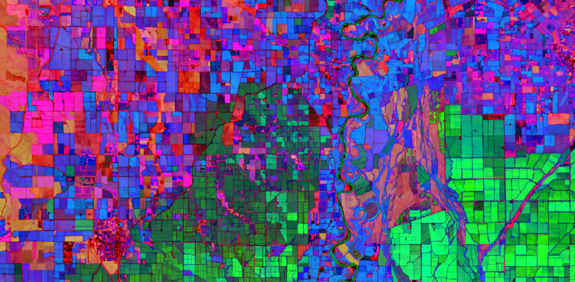
The composite is easiest to read by starting with the field boundaries and then examining the colors within them. Sharp color changes frequently follow the edges of individual fields, showing that neighboring crops or management areas followed different seasonal patterns.
The bright green fields in the southeastern portion of the image receive much of their displayed color from amplitude, indicating a pronounced difference between their lower and higher modeled NDVI values. Cyan fields combine strong amplitude with higher mean greenness, while pink, red, and orange fields receive more influence from phase and therefore represent different seasonal timing. The colors are relative combinations, so red does not simply mean one crop or green another.
Many of the large bright-green fields east of the Sacramento River were later assigned to rice by the harmonic-trend classifier. That does not independently verify that the fields contained rice, because the classifier used these same phenological variables. It does, however, illustrate how a distinctive seasonal signature can become evidence used by the model. The same crop may also appear in more than one color because of crop rotation, planting dates, irrigation, field conditions, or differences among years.
The time window used for harmonic modeling depends on the purpose of the analysis. A longer window generally produces a smoother, more generalized description of seasonal behavior because individual anomalies have less influence on the fitted pattern. A shorter window is more responsive to recent variation, but it is also more sensitive to unusual weather, cloud gaps, crop rotation, and other temporary conditions. Choosing the window therefore requires balancing a stable picture of typical seasonality against the need to preserve more recent change.
Isolating the agricultural signal
Once the seasonal behavior had been summarized, the next question was whether those signatures could help distinguish crop types. The 2024 USDA Cropland Data Layer (CDL) supplied the crop labels needed to train and evaluate that classification.
Because the CDL already identified which pixels represented agriculture, the model had a narrower task: assign crop types within known cropland rather than locate agricultural land from scratch. The CDL is an annual, crop-specific land-cover product created from satellite imagery and agricultural reference information. In this project, it served as both the cropland mask and the source of reference labels.
Before sampling, I prepared the CDL in R:
- Applied a 3 × 3 majority filter to reduce isolated “salt-and-pepper” pixels
- Removed non-agricultural land-cover classes
- Removed crop classes represented by fewer than 30 pixels
- Assigned descriptive crop names using the USDA crop-code table
- Drew a stratified sample of 50 pixels from each retained crop class
- Divided each class into approximately 70% training and 30% validation samples
Stratified sampling prevented widespread crops from overwhelming classes occupying smaller areas. The same training and validation locations were used for both classification models, allowing their results to be compared under consistent conditions.
The three phenological variables were also masked using the filtered CDL. This produced a cropland-only version of the composite.

Masking removes a lot of the visual complexity surrounding the fields and makes the agricultural mosaic especially clear. Neighboring crops may occupy similar terrain and experience the same weather, but their planting schedules and seasonal growth patterns still produce contrasting signatures.
Comparing a time series with one satellite scene
The second model used a single Landsat 9 scene downloaded from EarthExplorer in April 2025. Six 30-meter surface-reflectance bands were retained from the satellite imagery:
- Blue
- Green
- Red
- Near infrared
- Shortwave infrared 1
- Shortwave infrared 2
The image below assigns shortwave infrared 1, near infrared, and red reflectance to the red, green, and blue display channels. Healthy vegetation generally appears green in this combination, while moisture, bare soil, developed surfaces, and other land-cover characteristics produce different colors.
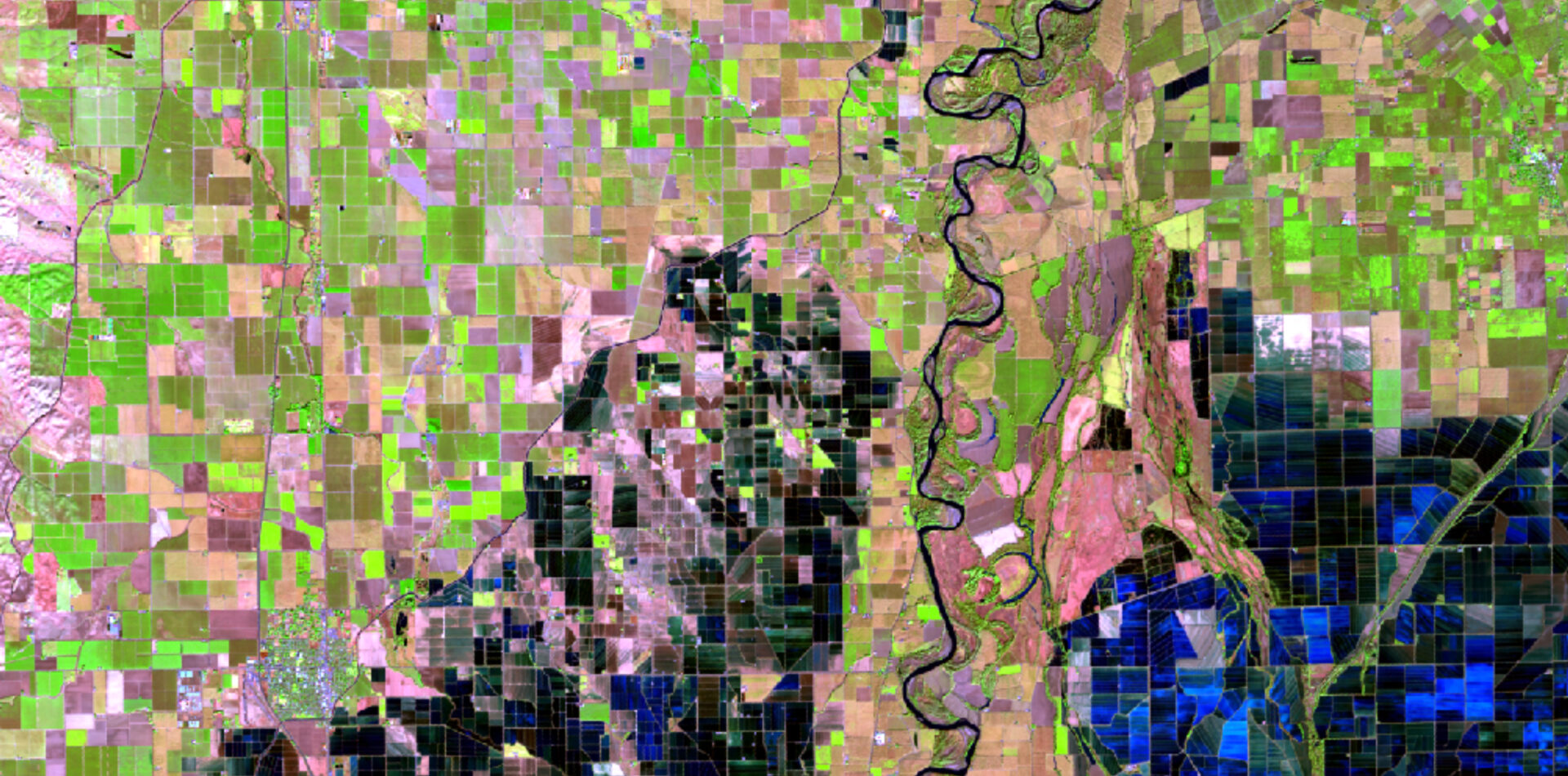
The contrast between the two approaches is fundamental. The phenological composite summarizes a sequence of observations and describes vegetation behavior across multiple growing seasons. The Landsat 9 image records the spectral condition of the same landscape at one particular time.
Classifying crops in two ways
Both classifications used random forest, a machine-learning method that builds many decision trees and combines their predictions. Each model used 1,000 trees, but the predictor variables differed.
| Model | Predictor variables | Information represented |
|---|---|---|
| Harmonic-trend model | Phase, amplitude, and mean NDVI | Timing and strength of seasonal vegetation change |
| Single-scene model | Blue, green, red, NIR, SWIR 1, and SWIR 2 | Spectral reflectance during one Landsat acquisition |
The essential structure of the harmonic-trend model in R was:
rf = randomForest(
  Class_Names ~ phase + amplitude + meanNDVI,
  data = extracted_values,
  ntree = 1000,
  importance = TRUE
)
The second model followed the same process but substituted the six Landsat 9 bands for the three phenological variables.
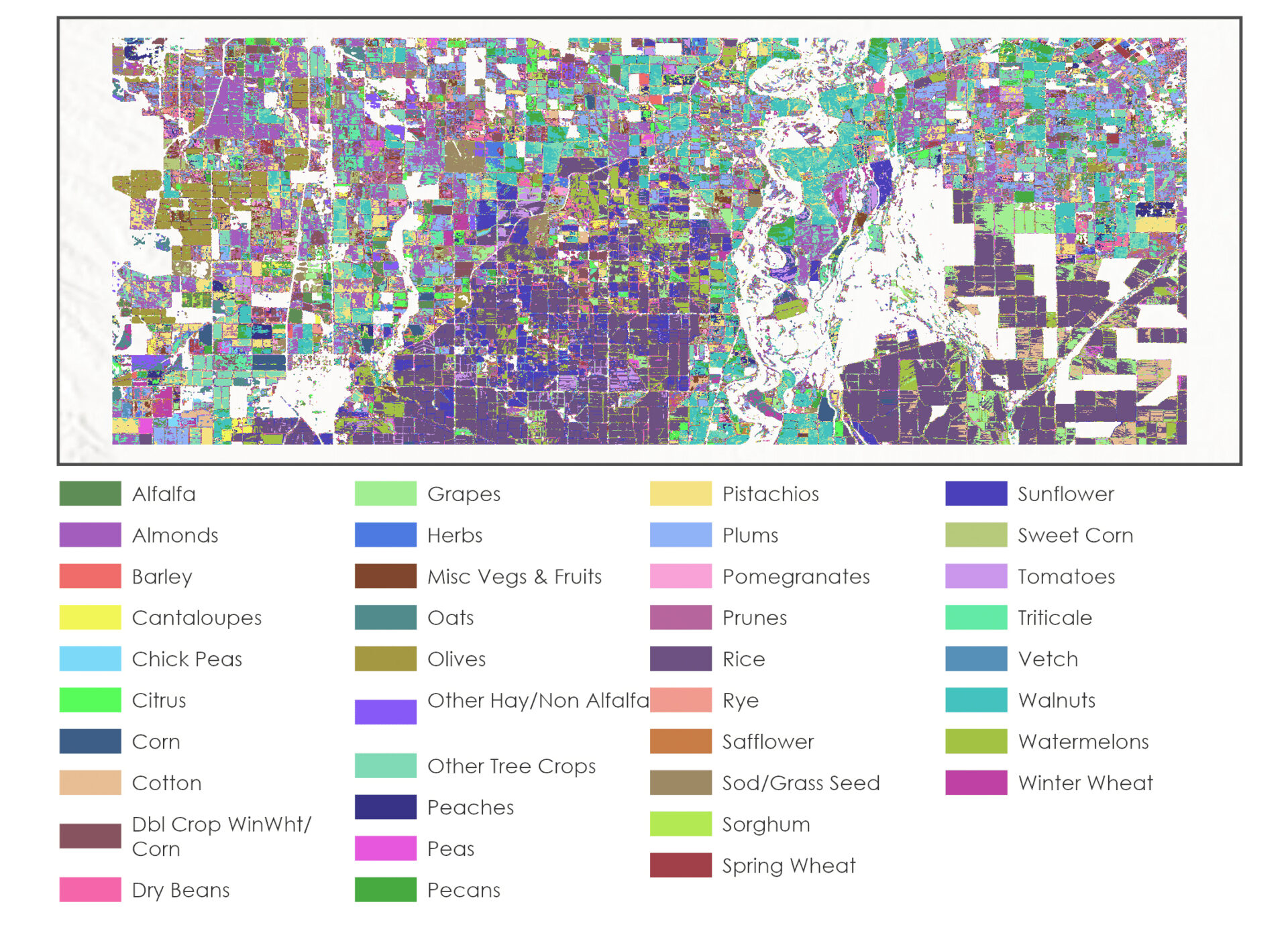
Harmonic-trend classification
The first random forest classified the retained cropland pixels using phase, amplitude, and mean NDVI.
Single-scene classification
The second random forest classified the same cropland area using the six Landsat 9 surface-reflectance bands.
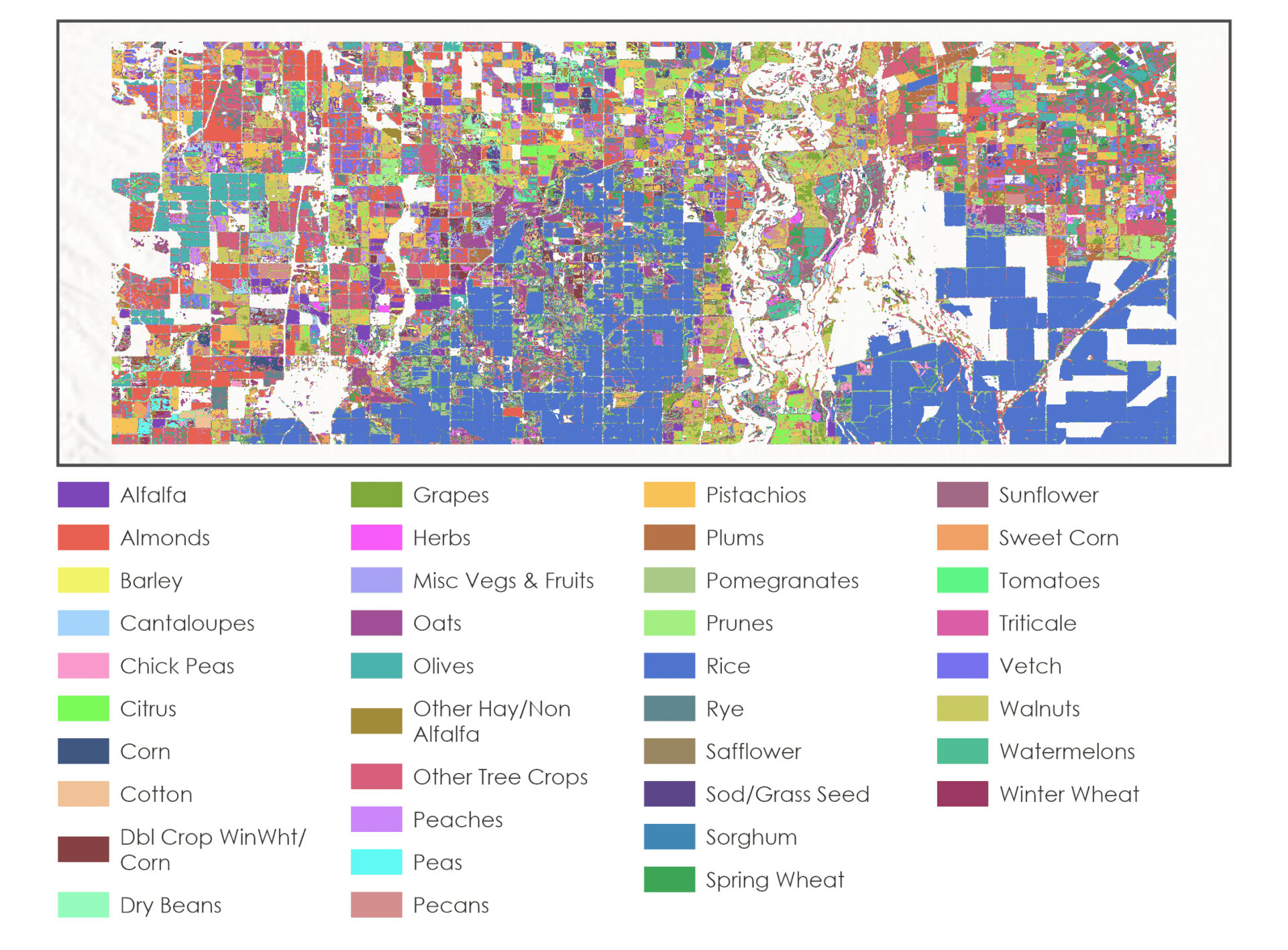
Both maps reproduce the broad agricultural patchwork, but the predicted crop labels differ substantially within individual fields. Those differences reflect the information available to each model: a summarized seasonal cycle in one case and a detailed spectral snapshot in the other.
Measuring agreement with the reference labels
The same set of withheld CDL-derived samples was used to evaluate both classifications. At each validation location, the crop predicted by the random forest was compared with the corresponding 2024 Cropland Data Layer label.
The two models produced the following overall agreement:
| Classification model | Overall agreement |
|---|---|
| NDVI harmonic trend | 56.3% |
| Single Landsat 9 scene | 52.0% |
The harmonic-trend model exceeded the single-scene model by approximately 4 percentage points. The difference was modest, but it suggests that seasonal timing, seasonal intensity, and average greenness collectively provided information that was not fully captured by one multispectral image.
Neither result indicates a highly reliable operational crop map. Instead, the comparison demonstrates that crop classifications can draw on two distinct kinds of remotely sensed information: how vegetation reflects energy at one moment and how its greenness changes over time.
Several limitations shape that interpretation:
- The validation labels came from the CDL, which is itself a remotely sensed classification rather than independent field observations.
- The harmonic variables summarized vegetation behavior from 2022 through 2024, while the reference labels represented 2024. Crop rotation may have weakened the relationship between the multi-year signal and the single-year crop labels.
- Thirty-meter pixels can contain mixtures of crops, field edges, roads, irrigation features, and surrounding land cover.
- Randomly divided pixels may place training and validation samples within the same agricultural fields, making them less independent than a field-based validation design.
- Because the sampling and training split were randomized without a fixed seed, exact agreement values may change slightly when the workflow is rerun.
- The outputs were masked using the CDL, so the analysis classified crop types within previously identified cropland rather than independently locating agricultural land.
Within those constraints, the two models provide a useful methodological comparison rather than a definitive crop inventory. A stronger operational assessment would use field observations, separate entire fields between training and validation, and test the models across multiple years and image dates.
From appearance to behavior
I find the phenological composite beautiful, but not simply because its colors are vivid. The colors are doing analytical work. Every shift in hue traces back to when vegetation became greenest, how strongly it changed through the seasons, or how green it remained on average.
That was the conceptual leap that stayed with me: one satellite image captures appearance, while a time series begins to describe behavior. Here, dozens of observations transformed a familiar patchwork of agricultural fields into a map of overlapping crop calendars.
That shift also has practical value. Crop-specific mapping can support agricultural inventories and acreage estimation, which are among the stated purposes of the USDA Cropland Data Layer. Related Landsat time-series methods can help researchers examine crop condition, changing agricultural patterns, and water consumption across large areas.
The classification itself was exploratory, but it made the larger possibility tangible: remotely sensed landscapes do not have to remain frozen images. With enough observations, they can begin to tell us something about timing, rhythm, and change.
Citations
Hijmans, R. J. (n.d.). terra: Spatial data analysis [R package]. CRAN. https://cran.r-project.org/package=terra
Kuhn, M. (n.d.). caret: Classification and regression training [R package]. CRAN. https://cran.r-project.org/package=caret
Liaw, A., & Wiener, M. (n.d.). randomForest: Breiman and Cutler’s random forests for classification and regression [R package]. CRAN. https://cran.r-project.org/package=randomForest
U.S. Department of Agriculture, National Agricultural Statistics Service. (n.d.). USDA NASS Cropland Data Layers [Data set]. Google Earth Engine Data Catalog. https://developers.google.com/earth-engine/datasets/catalog/USDA_NASS_CDL
U.S. Department of Agriculture, National Agricultural Statistics Service. (2024). 2024 Cropland Data Layer [Data set]. https://www.nass.usda.gov/Research_and_Science/Cropland/metadata/metadata_Cropland-Data-Layer-2024.htm
U.S. Geological Survey. (n.d.-a). EarthExplorer [Data portal]. https://earthexplorer.usgs.gov/
U.S. Geological Survey. (n.d.-b). Landsat 8 Collection 2 Tier 1 Level-2 [Data set]. Google Earth Engine Data Catalog. https://developers.google.com/earth-engine/datasets/catalog/LANDSAT_LC08_C02_T1_L2
U.S. Geological Survey. (n.d.-c). Landsat 9 Collection 2 Tier 1 Level-2 [Data set]. Google Earth Engine Data Catalog. https://developers.google.com/earth-engine/datasets/catalog/LANDSAT_LC09_C02_T1_L2
Categories: Mapping, Spatial analysis, Scripting and development, Image and remote sensing