Public art can be easy to walk past, especially in a place as familiar and busy as a university campus. This project began as a reason to slow down and look more closely: to build a field inventory of outdoor public art across the University of New Mexico’s Albuquerque campus, then turn those observations into a map people could explore.
Using Esri Field Maps, I collected locations and photographs for 35 artworks across main campus, the Health Sciences Center, and UNM Cancer Center. The project began as a static ArcGIS Pro layout and later expanded into an interactive web map and StoryMap, including an optional 6.2-mile walking route and a virtual tour of all 35 works.
Building the inventory
Although UNM maintains several public-art resources, I could not find a ready-to-use GIS dataset. I cross-referenced UNM’s Public Art Guide, the Engineering Student Success Center Self-Guided Art Tour, the Health Sciences Center Artwalk, and the university’s interactive campus map. The sources overlapped, but none provided every location with consistent descriptions and photographs.
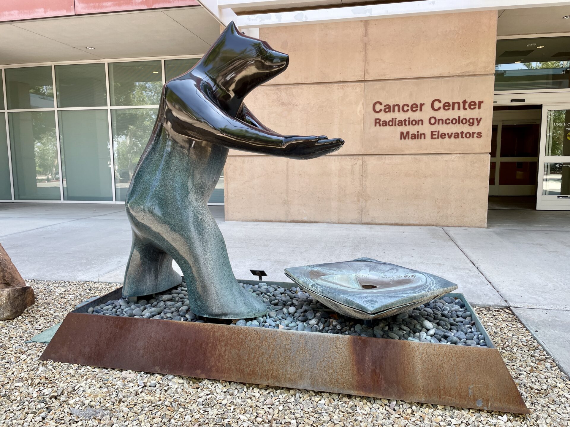
The source list kept growing during fieldwork. A decal on the ground beside Cloud / Rift led me to the Health Sciences Center Artwalk and its 12-stop north-campus guide. Most of those works had not appeared in the resources I started with. I also found one piece that was not documented in any of the sources. The inventory ultimately came together through research, field verification, and a certain amount of campus wandering.
Collecting the artwork
Before heading out, I configured a hosted point feature layer and web map for use in Field Maps. I walked the campus and used my phone’s GPS to record each artwork’s location, add a working title, and attach photographs. Later, in ArcGIS Pro, I populated the remaining fields after cross-checking the reference sources: artist, medium, year, location description, and a longer description.
GPS accuracy averaged about 15 feet and varied near buildings and tree cover. That was appropriate for a campus-scale inventory intended to help people find the art, but the points should not be read as survey-grade positions. Some works stood in open plazas; others were partially hidden by landscaping or tucked into courtyards and shaded alcoves. The map could point me in the right direction. The last few feet still required looking around.


From field inventory to map
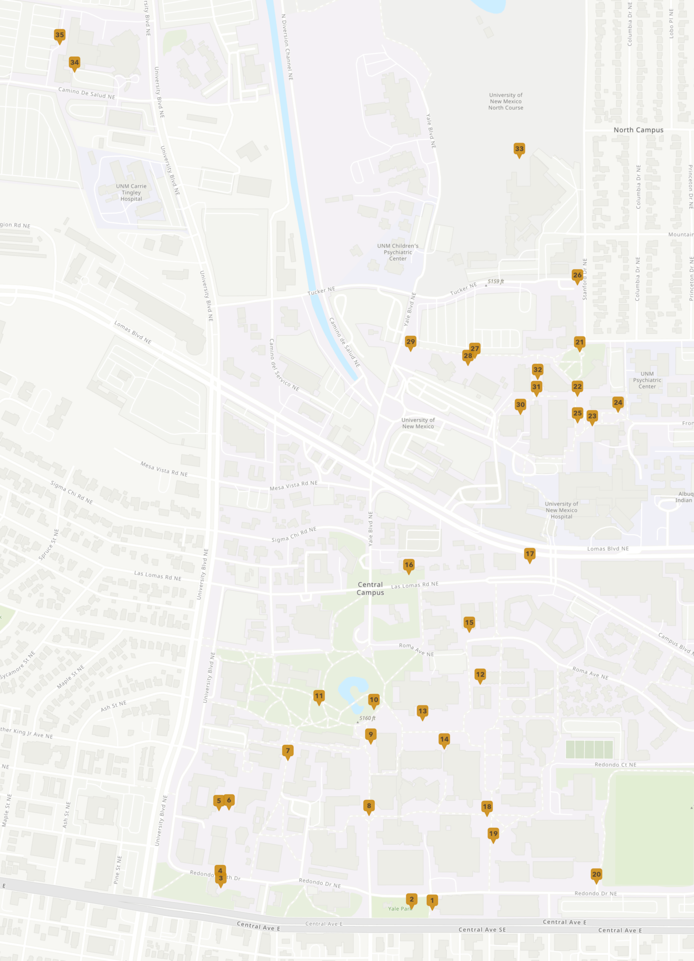
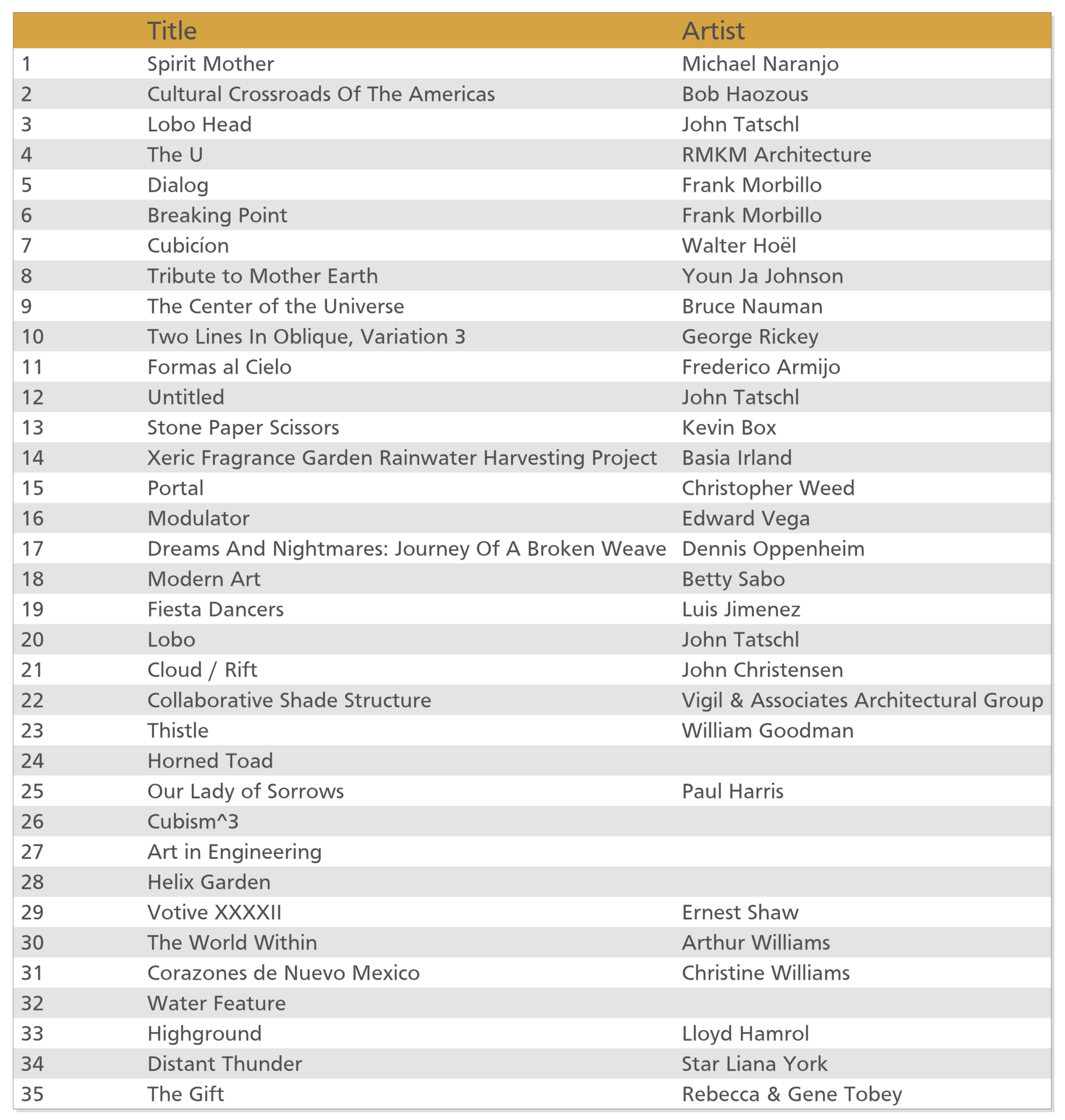
The first output was a static ArcGIS Pro layout. Gold map pins numbered 1 through 35 corresponded to a table frame listing each work’s title and artist, allowing the full inventory to remain legible across main campus, north campus, and the Cancer Center.
Publishing the feature layer and web map to ArcGIS Online created a different way to use the same data. Rather than matching a numbered marker to a table, viewers can select an artwork to open its title, artist, description, medium, year, and field photographs. The embedded Instant App below is the exploratory version of the project: less linear than the StoryMap and better suited to browsing.
Select a gold marker to view information and photographs for each work.
Turning the inventory into a walking tour
For the later StoryMap, I used ArcGIS Pro Network Analyst to generate an optional route linking all 35 artworks. The route covers roughly 6.2 miles and would take about two hours to walk — not counting the time spent stopping to look, which is admittedly the point.
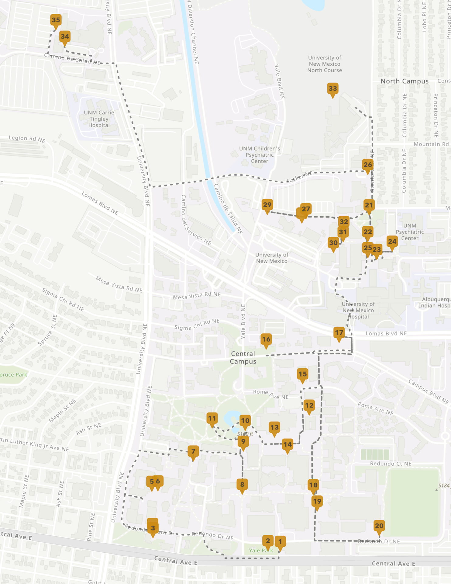
The StoryMap uses the route as an organizing spine, pairing a map sequence with photographs and descriptions for all 35 stops. It turns the dataset from an inventory into a guided experience, while the Instant App remains available for visitors who prefer to explore in their own order.
From inventory to invitation
Each format asks the data to do something different. The print layout provides a compact campus-wide reference; the Instant App supports open exploration; and the StoryMap adds sequence, context, and a virtual walking tour. Together, they show how one field-collected point layer can be reshaped for print, web mapping, and narrative presentation.
Collecting the data also changed how I moved through a familiar place. Some works were prominent; others were easy to miss, even after years of passing nearby. The finished project is both a guide and an invitation: walk a little slower, look a little closer, and let the campus surprise you.
Categories: Mapping, Spatial data management, Spatial analysis, Field operations